branding + logo design
Bronzed Tanning Co:
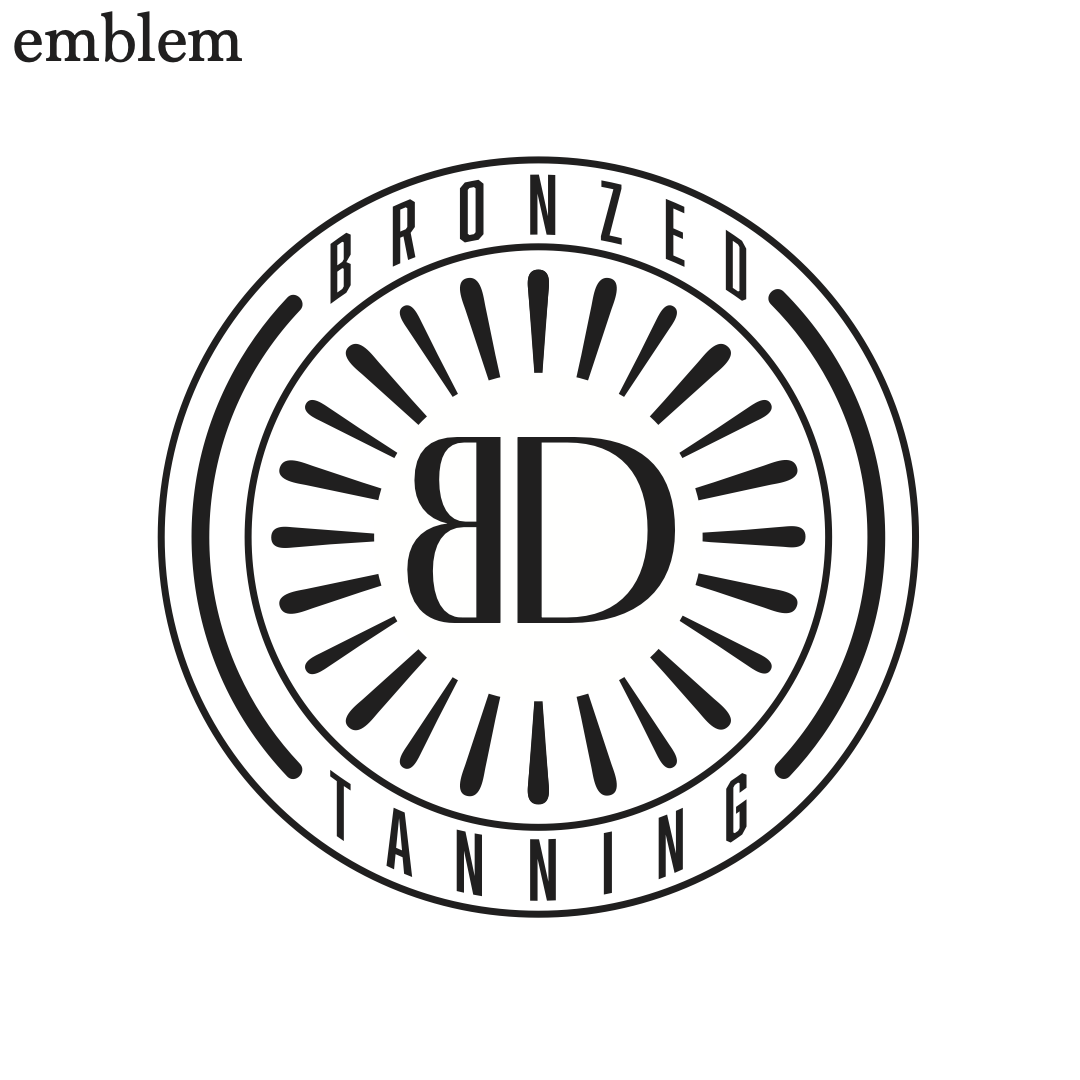
For this project, I developed a complete branding package for Bronzed, a self-tanning company. The process began with extensive research into logo design principles, elements, and historical examples. I explored all seven logo types—Lettermark, Wordmark, Abstract, Combination Mark, Emblem, Mascot, and Pictorial—by creating and refining different versions before digitizing and finalizing the strongest concepts. After receiving critique feedback, I refined the chosen logo. I began color exploration, selecting three distinct color groups with two- and three-color variations based on cultural associations, audience profiles, brand character, personal color relationships, and trends. I then compiled a mini-brand usage file detailing the proper coloring of the logo, including black and white versions, color specifications in Pantone, RGB, CMYK, and Hexadecimal, and guidance on appropriate file types for various applications.
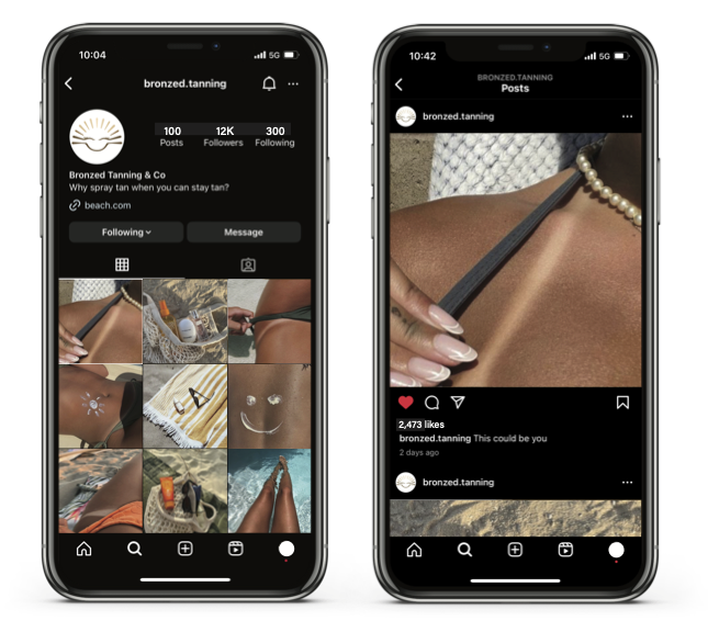
Additionally, I designed a brand presentation on an 11x17-inch layout featuring full-color and one-color logos, a stationery system (letterhead, envelope, and business card), color specifications, and an online mockup. For the digital presence, I designed a social media profile page for Instagram, incorporating the brand identity and key business information, then mocked it on a mobile device. The final deliverables showcase a cohesive, professional brand identity for Bronzed, ensuring consistency across both print and digital platforms.


Campbell’s bakery:
For this project, I rebranded Campbell's Bakery in Jackson, MS, a beloved local establishment known for its famous tea cakes. The objective was to create a fresh, modern, and cohesive brand identity while preserving the charm and nostalgia that make Campbell's Bakery special.
I began by redesigning their logo to emphasize their signature tea cake, which has been a customer favorite for years. This new logo better represents what sets them apart and provides a more recognizable and unique visual identity.
Next, I developed a comprehensive Brand Manual that outlined all essential brand elements, including logos, fonts, colors, visuals, and voice & tone. Each section was carefully crafted with clear guidelines for presenting the brand across various mediums. I ensured the manual was both easy to read and aesthetically pleasing, blending functionality with strong design principles to facilitate its use while maintaining a polished and professional appearance.
This project was more than just a visual update; it was about creating a stronger, more unified brand presence that captures the essence of Campbell’s Bakery and helps it continue to stand out in its community.


Fork finds mobile app:
For this project, I developed a mobile app to solve a common and often frustrating issue—deciding where to eat. My friends and I usually face challenges when choosing a restaurant, so I sought to create a fun and effortless solution to make that decision easier. The app I designed randomly selects a restaurant based on the user's location, eliminating the guesswork and adding excitement to the dining experience.
I researched existing restaurant recommendation apps. Many of these apps required excessive input, felt overcrowded, or lacked an engaging interface, which drove me to prioritize simplicity, usability, and an aesthetically pleasing design.
I began by creating a mood board with references to user-friendly designs, effective color schemes, and intuitive layouts. Following that, I sketched various interface options, mapped out the user journey, and meticulously designed the UI in Adobe Illustrator, ensuring that navigation was smooth and the visual components were appealing and practical. The finished app design showcases clean typography, engaging icons, and an interactive experience that invites users to discover new dining options. After incorporating feedback to refine my design, I compiled all components into a polished and visually striking PDF that details my research, design process, and final concept.
Please scroll through the images below to view how to navigate the app and see the design and layout I created.
The following images are projects that required me to design logs and posters for different events.


